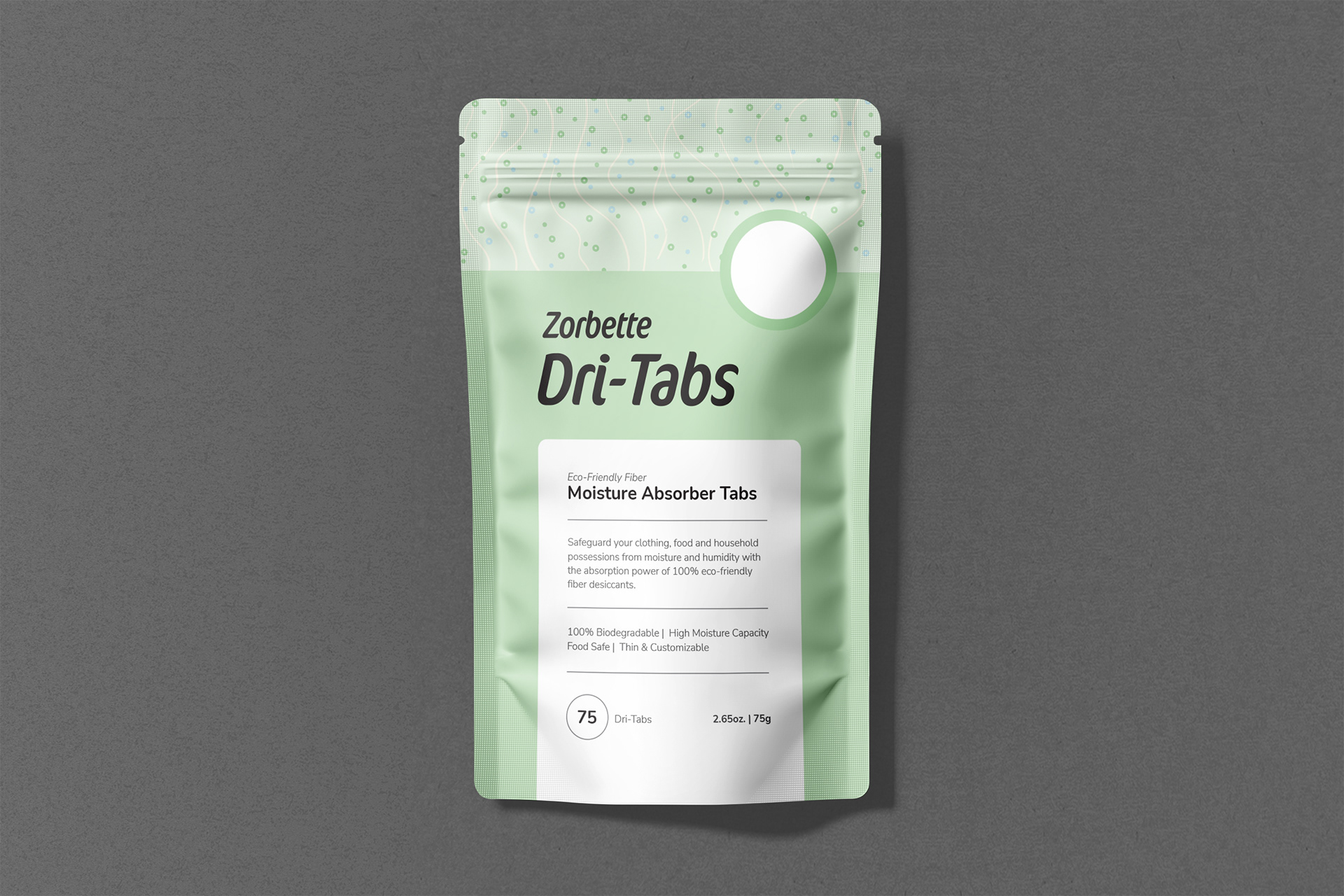
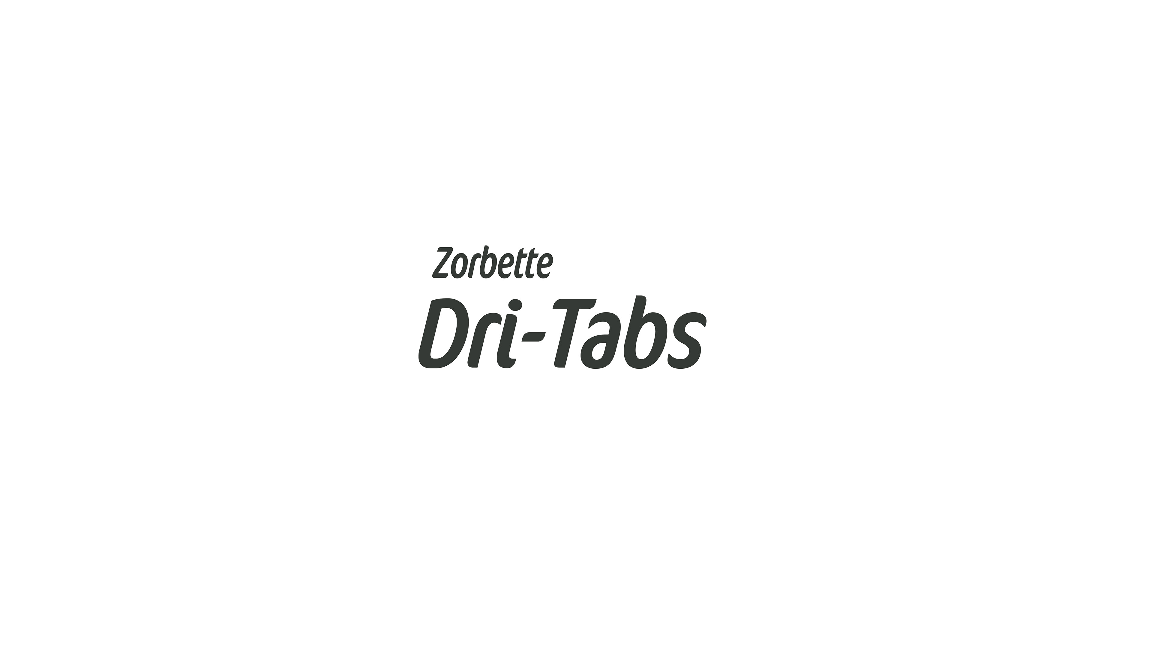
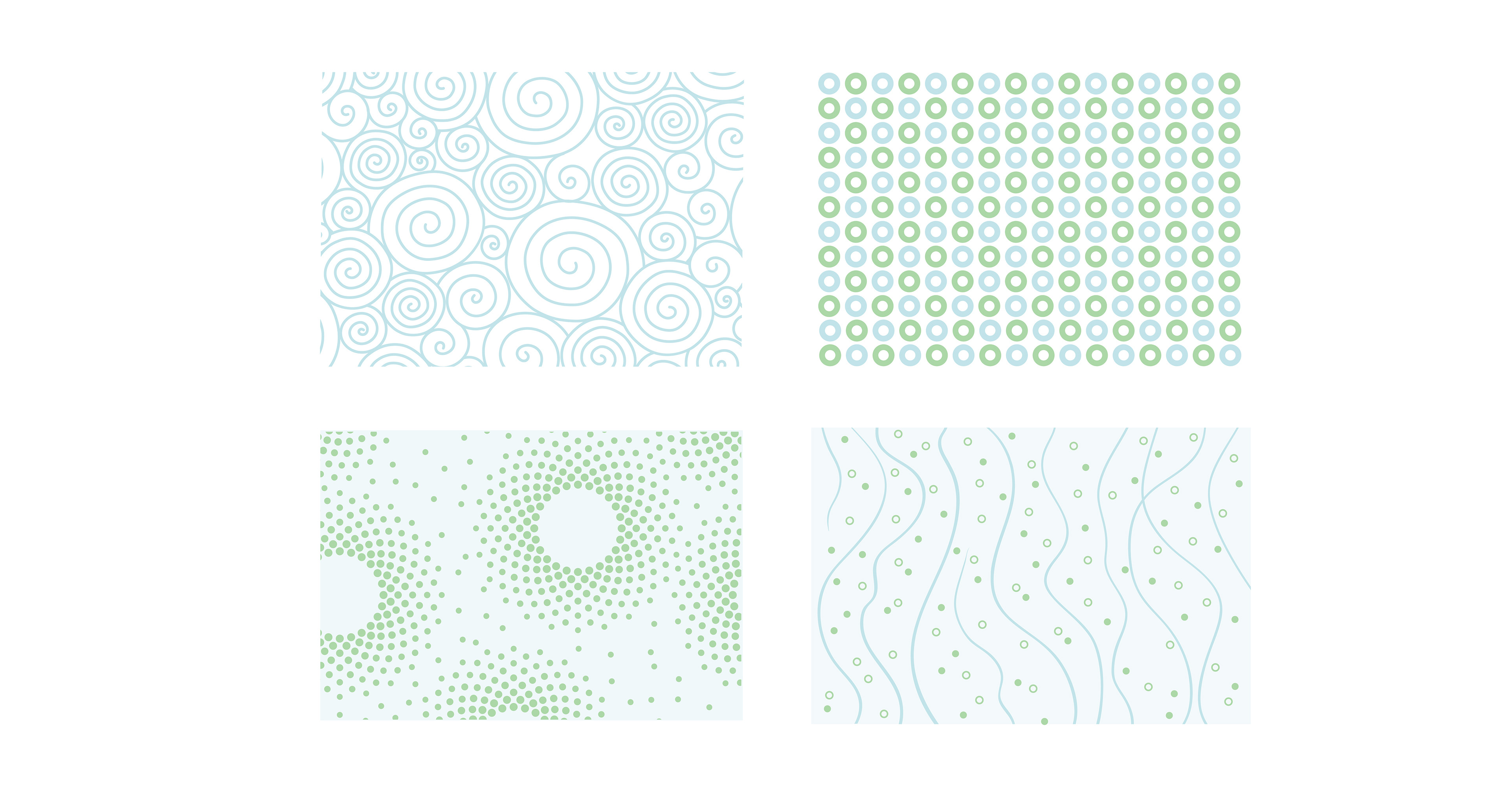
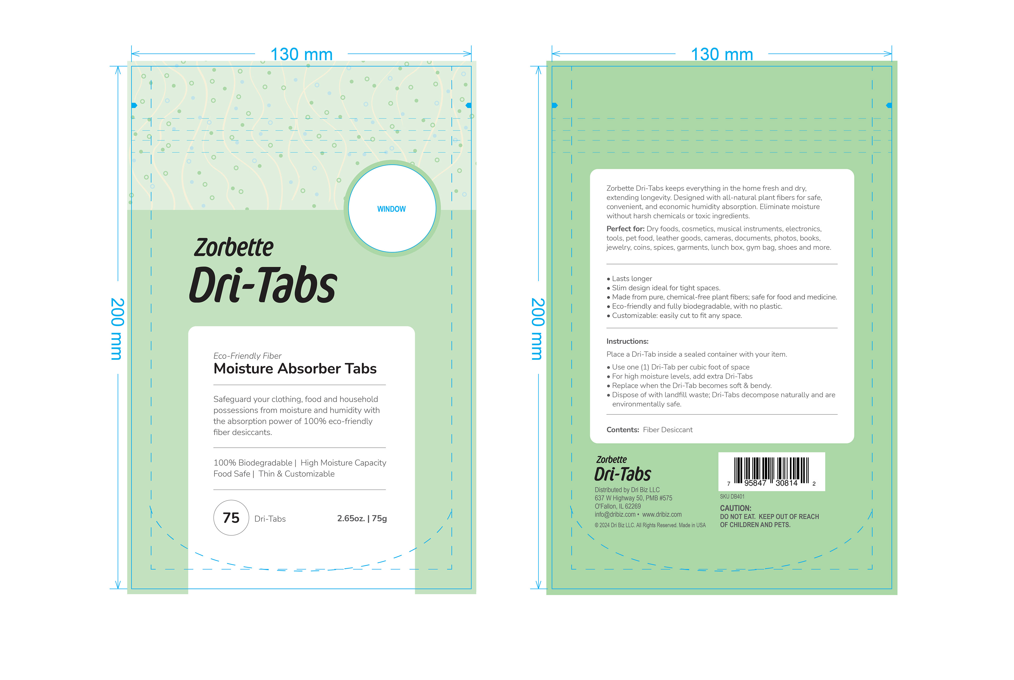
Zorbette Dri-Tabs absorb moisture from items in your home, such as dry food, jewelry, gym bags, crucial documents, keepsakes, and more. Zorbette asked me to redesign their packaging and logo. We wanted the logo to be simple and modern, to show that this is a new product on the market with its own unique story. We chose a soft mint green and blue color palette to evoke the idea that this product is made from all-natural fiber, and it's used to absorb moisture, which is by definition water diffused as vapor. This led to the idea of creating a pattern that represented plant-based fiber, vapor, and water molecules. I hope you enjoy these designs as much as the client did.
Zorbette Dri Tabs
Packaging and Brand Identity Design for a Household Product
You may also like
Compliance One
Marketing Collateral for a Company in the Healthcare Space
Motorq
Brand Development, Presentation Design, Print Ad, Blog Images and Social Assets for a Fleet Management Software Provider
Logan Pass Construction
Brand Development and Digital Design for a General Contractor in the Greater Denver Area
Hartford Athletic
Brand Development, Digital, Social and Presentation Design for a Connecticut Professional Soccer Team
SCIEX Power of Precision
Brand Development, Print, Digital and Social for the Americas Region of a Global Life Sciences Company.
Movement by Michelob Ultra and BFS
Designed Digital and Social Ads for a Fitness Initiative by an International Beer Brand and Northeast Fitness Centers
DISH Media / Sling TV
A Year-Round Ebook Design Challenge for a Leading Streaming Service
Infinity Group
Branding, Brand Development, Print, Digital, Social and Presentation Design for an Architecture and Planning Group
Total Digital Security
Brand Development, Iconography and Print for a Small Cyber-Security Business
College Hunks Hauling Junk & Moving
Digital Advertising Design