Infinity Group designs and builds beautiful workspaces for clients across the United States. They guide people through every aspect of the journey; from the idea, to when it becomes reality and employees are thriving. Infinity Group expanded their marketing efforts and wanted their creative to be more compelling. After the partners from my creative collective and I helped with rebuilding their website and their brand identity, I designed their marketing collateral, including the pieces shown here.
Brand Identity
I collaborated with a team to revitalize the existing brand by introducing a broader range of colors, incorporating a fresh typeface for headlines, and integrating new graphical elements. Additionally, we were tasked with updating the brand guidelines. Through a thorough brand identity discovery review session, we realized that employing colorful backgrounds and elements would detract from the vibrant principal photography showcasing the firm's interior designs. The solution? We chose to develop several textured backgrounds devoid of color, resembling modern furniture fabric or flooring, to ensure the photography remained the focal point.
Look Book
Infinity Group annually produced a Look Book and aimed for their latest publication to radiate elegance and cleanliness. To achieve this, I designed the layout to emphasize oversized images showcasing the firm's stunning interior designs as the primary focal point. I supplemented the images with generous white space and thoughtfully positioned type and call-outs throughout the book.
Presentation Design
Infinity Group requested a presentation to introduce 'Infinity Group Clear,' which encompasses Clear Strategy, Clear Architecture, Clear Engineering, and Clear Construction. Drawing inspiration from the name, I crafted a simple presentation characterized by strong contrast and a focus on clear space around each element, while giving Clear its own personality."
Social Media
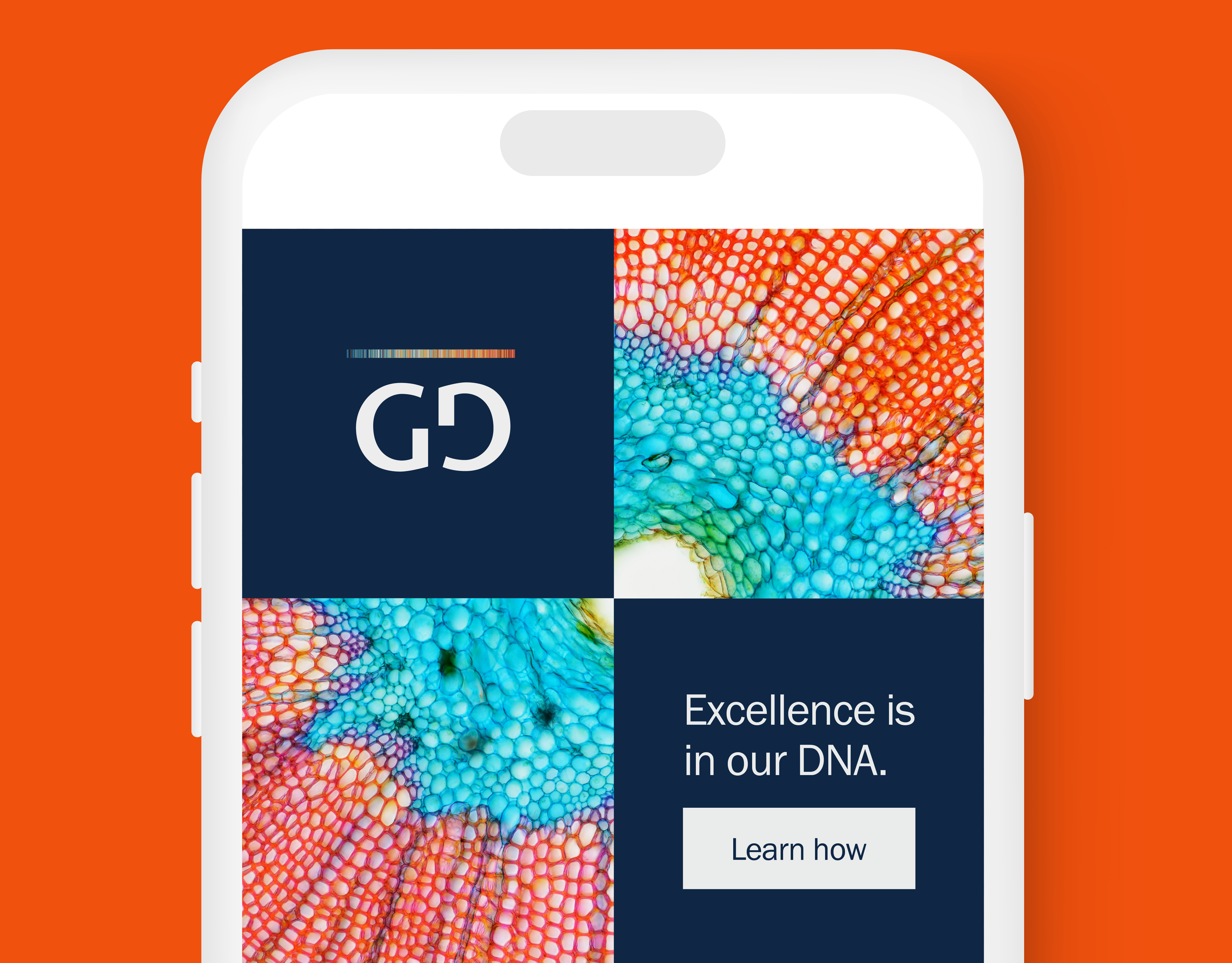
The marketing team at Infinity Group and I had a bit more fun with the firm's social media and created assets that were eye-catching and compelling to encourage users to seek more information about the company.
Digital Advertising
The digital ads we created matched well with the website, and stuck closely to the brand guidelines.
Business Cards
Business cards were kept simple, and utilized the back for the slogan and locations to emphasize scale and positioning.


